Analysing Twitter data: Exploring user profiles and relationships
Part 2: Exploring user profiles and relationships
In this blog article, I use the {rtweet} R package to explore Twitter user profiles and relationships between users from statuses collected during a scientific conference. This is the second part of my series “Analysing twitter data with R”. In the first part, I showed how I collected Twitter statuses related to a scientific conference.
Twitter is one of the few social media used in the scientific community. Users having a scientific Twitter profile communicate about recent publication of research articles, the tools they use, for instance softwares or microscopes, the seminars and conferences they attend or their life as scientists. For instance, on my personnal Twitter account, I share my blog articles, research papers, and slides, and I retweet or like content related to R programming and bioimage analysis topics. Twitter archives all tweets and offers an API to make searches on these data. The {rtweet} package provides a convenient interface between the Twitter API and the R software.
I collected data during the 2020 NEUBIAS conference that was held earlier this year in Bordeaux. NEUBIAS is the Network of EUropean BioImage AnalystS, a scientific network created in 2016 and supported till this year by European COST funds. Bioimage analysts extract and visualise data coming from biological images (mostly microscopy images but not exclusively) using image analysis algorithms and softwares developped by computer vision labs to answer biological questions for their own biology research or for other scientists. I consider myself as a bioimage analyst, and I am an active member of NEUBIAS since 2017. I notably contributed to the creation of a local network of Bioimage Analysts during my postdoc in Heidelberg from 2016 to 2019 and to the co-organisation of two NEUBIAS training schools, and I gave lectures and practicals in three NEUBIAS training schools. Moreover, I recently co-created a Twitter bot called Talk_BioImg, which retweets the hashtag #BioimageAnalysis, to encourage people from this community to connect with each other on Twitter (see “Announcing the creation of a Twitter bot retweeting #BioimageAnalysis” and “Create a Twitter bot on a raspberry Pi 3 using R” for more information).
In the first part of this series “Analysing twitter data with R: Collecting Twitter statuses related to a scientific conference”, I explained how I retrieved Twitter statuses containing at least one of the hashtags of the NEUBIAS conference. In this second part, I will look at the Twitter users who exchanged these Twitter statuses:
- total number of users and main contributors
- network of interactions between users
- location of users as indicated on their profile
Librairies
To get data on the Twitter users, I use the package {rtweet}. To store and read the data in the RDS format I use {readr}. To manipulate and tidy the data, I use {dplyr}, {forcats}, {purrr}, {stringr} and {tidyr}. To do forward geocoding of Twitter users locations, I use the package {opencage}. To build graphs of tweets and retweets, I use the packages {graphTweets} and {igraph}. To visualise the collected data, in general, I use the packages {ggplot2} and {RColorBrewer}. To visualise networks, I use {visNetwork}, and to make maps, I use {rnaturalearth} and {sf}.
library(dplyr)
library(forcats)
library(ggplot2)
library(graphTweets)
library(igraph)
library(opencage)
library(purrr)
library(RColorBrewer)
library(readr)
library(rnaturalearth)
library(rtweet)
library(sf)
library(stringr)
library(tidyr)
library(visNetwork)
Plots: Theme and palette
The code below defines a common theme and color palette for all the plots. The function theme_set() from {ggplot2} sets the theme for all the plots.
# Define a personnal theme
custom_plot_theme <- function(...) {
  theme_classic() %+replace%
    theme(
      panel.grid = element_blank(),
      axis.line = element_line(size = .7, color = "black"),
      axis.text = element_text(size = 11),
      axis.title = element_text(size = 12),
      legend.text = element_text(size = 11),
      legend.title = element_text(size = 12),
      legend.key.size = unit(0.4, "cm"),
      strip.text.x = element_text(size = 12, colour = "black", angle = 0),
      strip.text.y = element_text(size = 12, colour = "black", angle = 90)
    )
}

## Set theme for all plots
theme_set(custom_plot_theme())

# Define a palette for graphs
greenpal <- colorRampPalette(brewer.pal(9, "Greens"))
Data
Original data can be downloaded here. See part 1 “Analysing twitter data with R: Collecting Twitter statuses related to a scientific conference” for more details on how I collected and aggregated these Twitter statuses.
Total number of contributors and main contributors
total_user_nb <- all_neubiasBdx_unique %>%
  pull(screen_name) %>%
  unique() %>%
  length()

total_status_nb <- nrow(all_neubiasBdx_unique)

total_tweet_number <- all_neubiasBdx_unique %>%
  filter(!is_retweet) %>%
  pull(status_id) %>%
  unique() %>%
  length()
In total, 306 Twitter users exchanged Twitter statuses containing at least one of the hashtags of the NEUBIAS conference. As I calculated in part 1, 2629 statuses were exchanged among which only 661 of these Twitter statuses are tweets, meaning that only 25% of statuses were original content. Considering the high proportion of retweet, I was curious to compare the top ten of the main contributors by number of tweets with the top ten of the main contributors by number of retweets.
So, here is the top ten of the main contributors by number of tweets:
top_contributors_tweet <- all_neubiasBdx_unique %>%
  filter(!is_retweet) %>%
  count(screen_name) %>%
  arrange(desc(n)) %>%
  top_n(10)

top_contributors_tweet %>%
knitr::kable()| screen_name | n |
|---|---|
| martinjones78 | 132 |
| pseudoobscura | 125 |
| MaKaefer | 49 |
| anna_medyukhina | 26 |
| MarionLouveaux | 25 |
| Nicolas26538817 | 24 |
| jmutterer | 22 |
| Zahady | 18 |
| basham_mark | 15 |
| IgnacioArganda | 14 |
And here is the top ten of the main contributors by number of retweets:
top_contributors_retweet <- all_neubiasBdx_unique %>%
  filter(is_retweet) %>%
  count(screen_name) %>%
  arrange(desc(n)) %>%
  top_n(10)

top_contributors_retweet %>%
knitr::kable()| screen_name | n |
|---|---|
| fab_cordelieres | 501 |
| Nicolas26538817 | 128 |
| sebastianmunck | 91 |
| NEUBIAS_COST | 87 |
| gomez_mariscal | 75 |
| VincentMaioli | 64 |
| martinjones78 | 61 |
| jmutterer | 55 |
| jytinevez | 43 |
| Olu_GH | 39 |
Only three users are present in both top ten, suggesting that users in this dataset are either content producers or content amplifiers.
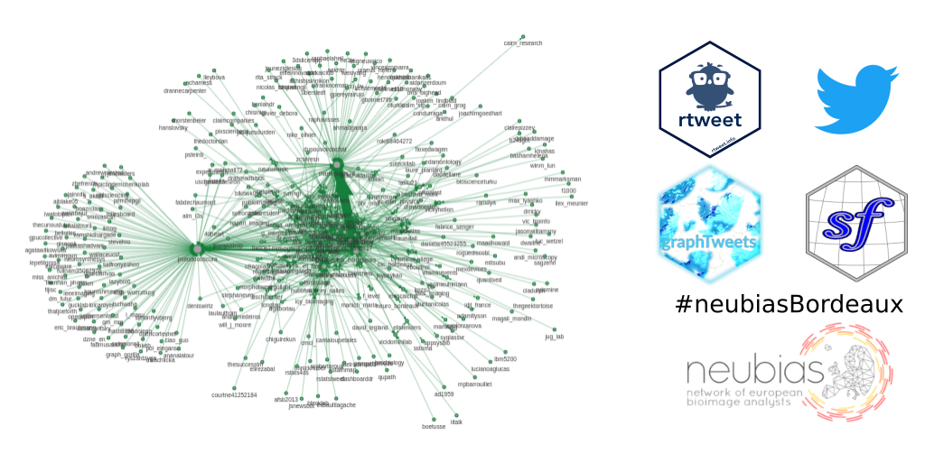
Graph of users
I was curious to visualise the graph of relationships between users, more precisely, who retweets who. To construct the graph, I used the library {graphTweets} and converted the graph as an igraph object. To visualise the graph, I used the library {visNetwork} and the visIgraph() function. Each node corresponds to a Twitter user, and each edge corresponds to a retweet. The size of the node corresponds to the number of time this person was retweeted. The arrow points from the user who did the retweet to the user who was retweeted. The width of the edge is proportionnal to the number of retweets.
The graph is interactive: use the mouse wheel to zoom in and out, click and drag a point in the background to move the entire graph, click on the center of a node to highlight this node and its edges, click and drag a point in the center of a node to move this node around, and click on an edge to select it.
net <- all_neubiasBdx_unique %>%
  filter(is_retweet == TRUE) %>%
  gt_edges(screen_name, retweet_screen_name) %>%
  gt_nodes() %>%
  gt_graph()


edges_col <- igraph::edge_attr(net, name = "n") %>%
  cut(breaks = seq(0, 120, 20), labels = 1:6)

net <- set_edge_attr(graph = net, name = "width", value = 2^(as.numeric(edges_col)))
net <- set_vertex_attr(graph = net, name = "value", value = vertex_attr(net, name = "n"))

visIgraph(net) %>%
  visLayout(randomSeed = 42, improvedLayout = TRUE) %>%
  visEdges(
    color = list(
      color = greenpal(6)[5]
    ),
  ) %>%
  visNodes(
    color = list(
      background = "#A3A3A3",
      border = "##4D4D4D",
      highlight = "#ff0000",
      hover = "#00ff00"
    ),
    font =
      list(
        size = 40
      )
  )
I was surprised to discover that most of the users retweet another user only once or twice, and that a couple of users retweet much more than that, and they retweet much more some users in particular.
Getting the approximate location of Twitter users using forward geocoding
I wanted to know from which countries the Twitter users from my dataset where coming from. I expect a bias toward european countries, as the conference was held in Bordeaux, France, and as NEUBIAS is, as its name says, a European network. At the same time, it is also an international conference, with an international reputation, so let’s have a look.
Twitter displays the location that the users accept to give. It might not be true, it might not be accurate, it might be mispelled, it might not be a real location on earth, or it could correspond to several locations on earth. For these reasons, I need to do forward geocoding, i.e. encoding the human readable location given by the user into geographical coordinates.
Here is for instance the location of some of the Twitter users from my dataset:
users_location_example <- all_neubiasBdx_unique %>%
  select(
    screen_name,
    location,
    description
  ) %>%
  distinct() %>%
  head()

users_location_example %>%
knitr::kable()| screen_name | location | description |
|---|---|---|
| fabdechaumont | Playing with mice | |
| BlkHwk0ps | Just were I have to be. | Looping home 127.0.0.1 … always coming back to Python doctor, don´t know why… |
| AshishJainNikon | Eastern Canada | Advanced Imaging and Sales Specialist for Eastern Canada at Nikon Instruments |
| pseudoobscura | Berlin, Germany | Data Scientist | Bioimage Analyst @LeibnizFMP; Computer Vision; Data Analysis; Microscopy; Biology. |
| MascalchiP | Aquitaine, France | Formerly academic #microscopist, now sales & application specialist at DRVision #Aivia #AI #imageanalysis #cloud #machinelearning #deeplearning #VR #microscopy |
| Laura_nicolass | Madrid, Comunidad de Madrid | PhD student Uc3m. Studying multimodal image registration and part of ERA4Tb tuberculosis project. |
To do forward geocoding, I use the package {opencage}, which is an interface to the OpenCage API. To use the {opencage}, one has to create an account on Open Cage API in order to get a token. The token must be stored into the .Renviron file. To do so, open the file with the command below, and add the following line OPENCAGE_KEY="your_token_here" with your own token.
usethis::edit_r_environ()As shown in the figure below, I go through three steps: (1) getting the users location from Twitter API, (2) coding these human readable locations into geographical coordinates with the OpenCage API, and (3) checking and cleaning the result to keep only one set of geographical coordinates maximum per user.

I first retrieve all information on the Twitter users in my dataset using the lookup_users() function from {rtweet}.
user_info <- lookup_users(unique(all_neubiasBdx_unique$user_id))
write_rds(user_info, path = "data_out_neubias/user_info.rds")
Then I extract the location information from the profile of each user and I use the opencage_forward() function from {opencage} to encode this location into latitude and longitude. And I store this information in an .rds file, as the number of calls to the OpenCage API is limited per day, and it is not a good practice to overload unnecessarily the API with repetitive requests.
location_forward <- user_info %>%
  filter(location != "") %>%
  distinct(location) %>%
  pull(location) %>%
  map(function(x) opencage_forward(placename = x, no_record = TRUE)) # does not save the exact query

readr::write_rds(location_forward, path = "data_out_neubias/2020-03-29_location_forward.rds")
For each Twitter user, I now have one or several putative geographical locations. Forward geocoding is not 100% accurate: it often provides several sets of geographical coordinates that are very close to each other and correspond to the same place, but it can also provide sets that correspond to very different places, and even sometimes that belong to different countries.
I would like to keep only one location per user to make a map. My strategy is to check the consistency of the results using the components.country variable provided by the opencage_forward() function, rather than latitute and longitude.
For this purpose, I wrote the country_check() function. This function extracts the components.country variable, and checks if it is unique. If it is unique, i.e. there is either only one set of geographical coordinates or there is several but they all are located in the same country, the function keeps the first set of coordinates. Otherwise, it returns NA.
#' This function checks if one or several countries have been found for a given location by opencage_forward
#'
#' @param coded_elt result of forward geocoding request
#'
#' @return the first result if country is unique, NA otherwise
#'
#' @importFrom purrr pluck
#' @export
#'
#' @examples
country_check <- function(coded_elt) {
  if (pluck(coded_elt, "total_results") == 0) { # no results
    pluck(coded_elt, "results")
  } else { # one or several results
    if (pluck(coded_elt, "total_results") == 1) { # one result
      pluck(coded_elt, "results")
    } else { # several results
      if (length(unique(pluck(coded_elt, "results", "components.country"))) == 1) { # one country
        pluck(coded_elt, "results")[1, ]
      } else { # several countries
        pluck(coded_elt, "results")[pluck(coded_elt, "total_results") + 1, ]
      }
    }
  }
}
I now apply my function on the locations I stored.
location_forward_checked <- location_forward %>%
  map_df(country_check)
I can now join the geographical information with the users data. The query saved by opencage_forward() does not exactly match the character string stored in user_info. To make a clean junction between the users’ information and the location encoded by forward geocoding, I first clean the location and query columns using the following functions from the {stringr} package: str_trim(), which removes whitespaces from start and end of a string, and str_to_lower(), which converts a string to lower case.
user_info_clean <- user_info %>%
  mutate(location_clean = str_trim(location) %>% str_to_lower())

location_forward_checked_clean <- location_forward_checked %>%
  mutate(query_clean = str_trim(query) %>% str_to_lower()) %>%
  group_by(query_clean) %>%
  summarise_all(first)

user_info_with_loc <- left_join(user_info_clean, location_forward_checked_clean, by = c("location_clean" = "query_clean"))
Displaying the origin of users on a world map
In the figure below, I summarise the two steps needed to display the users location on the world map. I already have a country information coming from the results of the OpenCage API request. However, I am not sure that the names of the countries in OpenCage corresponds to the names I have in the world map from {rnaturalearth}. For instance, I could have USA in one and United States of America in the other. The strategy here is to (1) join the set of geographical coordinates on the world map using the st_join() function from {sf}, and then, (2) use the countries from the world map on which these points are located.
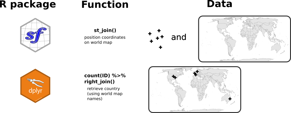
I first import a world map background from the {rnaturalearth} package.
map_world <- ne_countries(type = "countries", returnclass = "sf", scale = "medium") %>%
  lwgeom::st_make_valid() %>%
  mutate(ID = 1:n()) %>%
  # Choose a projection correct for the World (Eckert IV)
  st_transform(map_world, crs = "+proj=eck4 +lon_0=0 +x_0=0 +y_0=0 +datum=WGS84 +units=m +no_defs")

map_world_centroid <- map_world %>%
  st_centroid(of_largest_polygon = TRUE)
Then, I transform the users locations as sf objects.
location_as_sf <- user_info_with_loc %>%
  filter(!is.na(geometry.lat) & !is.na(geometry.lng)) %>%
  select(geometry.lat, geometry.lng) %>%
  st_as_sf(coords = c("geometry.lng", "geometry.lat"), crs = 4326) %>%
  st_transform(map_world, crs = "+proj=eck4 +lon_0=0 +x_0=0 +y_0=0 +datum=WGS84 +units=m +no_defs")
I join the users location with the countries using the function st_join() (spatial join) and I count the number of users per country.
nb_users_from_map <- location_as_sf %>%
  st_join(map_world) %>%
  st_drop_geometry() %>%
  count(ID) %>%
  right_join(map_world_centroid, by = "ID") %>%
  filter(!is.na(n))
I display the world map and the number of users per country as points positionned on the centroid of the countries. The size of the point is proportionnal to the number of users and the color also changes with the number of users to help discriminate small points from bigger ones.
ggplot() +
  geom_sf(data = map_world, fill = "grey90", color = "grey60", size = 0.2) +
  geom_sf(
    data = nb_users_from_map,
    aes(geometry = geometry, size = n, color = n), show.legend = "point"
  ) +
  scale_color_viridis_c() +
  scale_size_continuous(range = c(1, 10)) +
  labs(color = "Number\nof Twitter users") +
  custom_plot_theme() +
  coord_sf()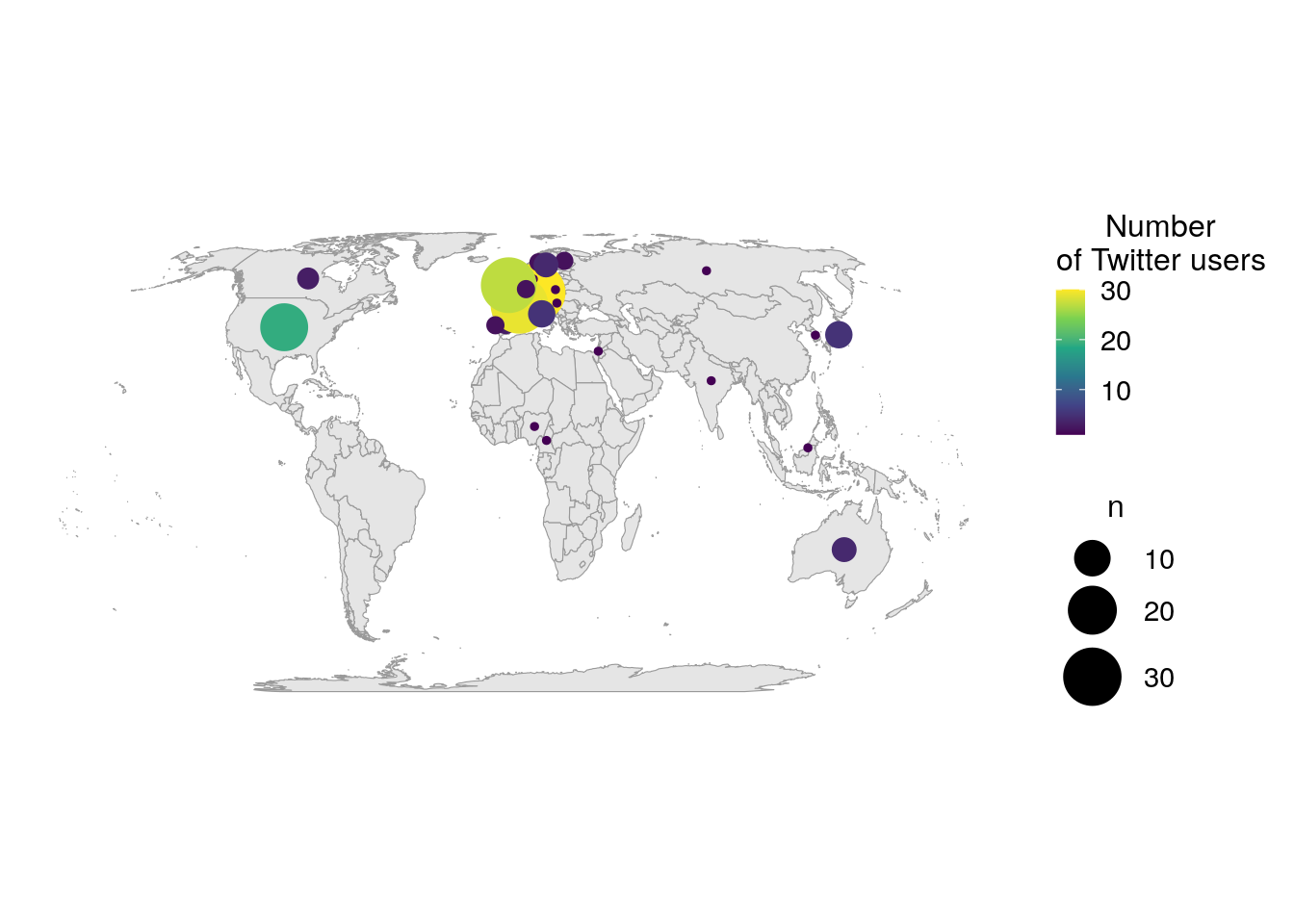
As there are a lot of users in Europe, I’m zooming in on that part of the world.
europe_cropped <- st_crop(map_world, xmin = -2000000, xmax = 8374612 , ymin = 4187306 , ymax = 8374612)

ggplot() +
  geom_sf(data = europe_cropped, fill = "grey90", color = "grey60", size = 0.2) +
  geom_sf(
    data = filter(nb_users_from_map, continent == "Europe"),
    aes(geometry = geometry, size = n, color = n), show.legend = "point"
  ) +
  scale_color_viridis_c() +
  scale_size_continuous(range = c(1, 10)) +
  labs(color = "Number\nof Twitter users") +
  custom_plot_theme() +
  coord_sf(expand = FALSE)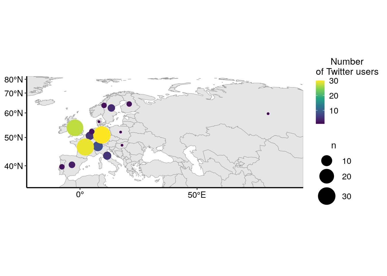
As explained above, I expected a quite high number of Twitter users from Europe. Interestingly, there is also many users from the USA, but also from other countries, like Canada, Australia or Japan. The barplot below shows the number of Twitter users for the top ten most represented countries in my dataset. I can reasonnably suppose that not all Twitter users that used the conference hastags were at the conference. Thus, the graph below represents more the internationnal echo that this conference had on Twitter rather than the origin of conference participants.
nb_users_from_map %>%
  top_n(10, n) %>%
  ggplot(aes(x = reorder(name_long, n), y = n)) +
  geom_col(fill = greenpal(2)[2]) +
  coord_flip() +
  labs(
    x = NULL,
    y = "Number of Twitter users"
  ) +
  custom_plot_theme() +
  scale_y_continuous(expand = c(0, 0))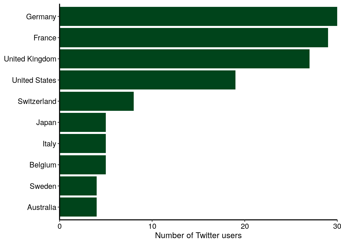
Conclusion
In the first part of this series “Analysing twitter data with R: Collecting Twitter statuses related to a scientific conference”, I explained how I collected and aggregated Twitter statuses containing at least one of the hashtags of the NEUBIAS conference.
Here, in this second part, I looked at the profile of Twitter users present in this dataset. First, I counted the total number of users that had posted Twitter statuses containing at least one of the hashtags of the NEUBIAS conference, and ranked the top ten main contributors for the number of tweets and retweets. Second, I drew a network of interaction between these users, looking for who was retweeting who. Third, I created a map localising the users using the location displayed on their Twitter profile.
In the third part of this serie, I will explore the content of the Twitter tweets.
Acknowledgements
I would like to thank Dr. Sébastien Rochette for his help on {sf}.
Resources
I highly recommend reading the {rtweet} vignette, the {graphTweets} vignette, the {visNetwork} vignette and the {opencage} vignette. I also recommend reading this blog article on how to zoom in on maps with sf and ggplot2.
Citation:
For attribution, please cite this work as:
Louveaux M. (2020, Mar. 29). "Analysing Twitter data: Exploring user profiles and relationships". Retrieved from https://marionlouveaux.fr/blog/twitter-analysis-part2/.
@misc{Louve2020Analy,
    author = {Louveaux M},
    title = {Analysing Twitter data: Exploring user profiles and relationships},
    url = {https://marionlouveaux.fr/blog/twitter-analysis-part2/},
    year = {2020}
  }

Share this post
Twitter
Google+
Facebook
LinkedIn
Email