Analysing Twitter data: Exploring tweets content
Part 3: Exploring tweets content
In this blog article, I use the {rtweet} R package to explore Twitter user profiles and relationships between users from statuses collected during a scientific conference. This is the third and last part of my series “Analysing twitter data with R”. In the first part, I showed how I collected Twitter statuses related to a scientific conference. In the second part, I explored user profiles and relationships between users.
Twitter is one of the few social media used in the scientific community. Users having a scientific Twitter profile communicate about recent publication of research articles, the tools they use, for instance softwares or microscopes, the seminars and conferences they attend or their life as scientists. For instance, on my personnal Twitter account, I share my blog articles, research papers, and slides, and I retweet or like content related to R programming and bioimage analysis topics. Twitter archives all tweets and offers an API to make searches on these data. The {rtweet} package provides a convenient interface between the Twitter API and the R software.
I collected data during the 2020 NEUBIAS conference that was held earlier this year in Bordeaux. NEUBIAS is the Network of EUropean BioImage AnalystS, a scientific network created in 2016 and supported till this year by European COST funds. Bioimage analysts extract and visualise data coming from biological images (mostly microscopy images but not exclusively) using image analysis algorithms and softwares developped by computer vision labs to answer biological questions for their own biology research or for other scientists. I consider myself as a bioimage analyst, and I am an active member of NEUBIAS since 2017. I notably contributed to the creation of a local network of Bioimage Analysts during my postdoc in Heidelberg from 2016 to 2019 and to the co-organisation of two NEUBIAS training schools, and I gave lectures and practicals in three NEUBIAS training schools. Moreover, I recently co-created a Twitter bot called Talk_BioImg, which retweets the hashtag #BioimageAnalysis, to encourage people from this community to connect with each other on Twitter (see “Announcing the creation of a Twitter bot retweeting #BioimageAnalysis” and “Create a Twitter bot on a raspberry Pi 3 using R” for more information).
In the first part of this series “Analysing twitter data with R: Collecting Twitter statuses related to a scientific conference”, I explained how I retrieved Twitter statuses containing at least one of the hashtags of the NEUBIAS conference. In the second part, I explored user profiles and relationships between users.
In this third and last part, I will explore the content of tweets:
- most popular conference hashtag
- hashtags associated to the conference hashtag
- most frequently used emojis
- wordcloud
Librairies
To store and read the data in the RDS format I use {readr}. To manipulate and tidy the data, I use {dplyr}, {forcats}, {purrr} and {tidyr}. To visualise the collected data, I use the packages {ggplot2} and {RColorBrewer}. To extract the emojis from the tweets I use the emojis database from {rtweet}. To construct the corpus from the tweets’ text, I use the package {tm} and to display the wordcloud, I use {wordcloud2}.
library(dplyr)
library(forcats)
library(ggplot2)
library(here)
library(purrr)
library(readr)
library(RColorBrewer)
library(rtweet)
library(stringr)
library(tidyr)
library(tm)
library(wordcloud2)
Plots: Theme and palette
The code below defines a common theme and color palette for all the plots. The function theme_set() from {ggplot2} sets the theme for all the plots.
# Define a personnal theme
custom_plot_theme <- function(...){
  theme_classic() %+replace%
    theme(panel.grid = element_blank(),
          axis.line = element_line(size = .7, color = "black"),
          axis.text = element_text(size = 11),
          axis.title = element_text(size = 12),
          legend.text = element_text(size = 11),
          legend.title = element_text(size = 12),
          legend.key.size = unit(0.4, "cm"),
          strip.text.x = element_text(size = 12, colour = "black", angle = 0),
          strip.text.y = element_text(size = 12, colour = "black", angle = 90))
}

## Set theme for all plots
theme_set(custom_plot_theme())

# Define a palette for graphs
greenpal <- colorRampPalette(brewer.pal(9,"Greens"))
Reading data collected in part 1
Original data can be downloaded here. See part 1 “Analysing twitter data with R: Collecting Twitter statuses related to a scientific conference” for more details on how I collected and aggregated these Twitter statuses.
Finding the most popular conference hashtag
As I mentionned in part 1 “Analysing twitter data with R: Collecting Twitter statuses related to a scientific conference”, the local organisers defined several hashtags for the NEUBIAS conference that I called “the conference hashtags”. As illustrated with the thread below, this raised two main interrogations: why several hashtags instead of one? which one will be the most popular?
tweet_shot("https://twitter.com/VincentMaioli/status/1233458216413126657")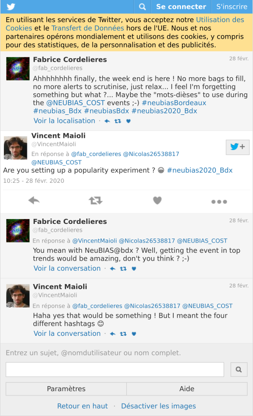
In the data I collected and aggregated in part 1 “Analysing twitter data with R: Collecting Twitter statuses related to a scientific conference”, the column hashtags gathers as list the hashtags used in each Twitter status (tweet or retweet).
all_neubiasBdx_unique %>%
  filter(!is_retweet) %>%
  select(hashtags) %>%
  as.data.frame() %>%
  head() %>%
knitr::kable()| hashtags |
|---|
| c(“bioimageanalysis”, “neubiasBordeaux”) |
| c(“clij”, “clij2”, “neubiasBordeaux”, “opensource”, “GPUpower”) |
| neubiasBordeaux |
| neubiasBordeaux |
| neubiasBordeaux |
| c(“neubiasBordeaux”, “openscience”, “bioimageanalysis”) |
Here, I choose to work only on the tweets and not on the retweets to highlight the choices of the Twitter users, not what was amplified in the end. I unnest the hashtags column, meaning that I flatten the lists into separate rows. Then I keep only the hashtags of the conference. And I count them and arrange them by descending order.
most_popular <- all_neubiasBdx_unique %>%
  filter(!is_retweet) %>%
  unnest(hashtags) %>%
  mutate(hashtags_unnest = tolower(hashtags)) %>%
  filter(!is.na(hashtags_unnest)) %>%
  filter(hashtags_unnest %in% c("neubiasbordeaux", "neubias_bdx", "neubiasbdx",
                                "neubias2020_bdx", "neubias2020")) %>%
  count(hashtags_unnest) %>%
  arrange(desc(n)) %>%
  top_n(10, n)
The most popular conference hashtag is clearly #neubiasbordeaux. It was used in 561 tweets over 661 tweets in total, meaning that around 85% of the tweets in this dataset carry this hashtag.
ggplot(data = most_popular) +
   geom_col(aes(fct_reorder(hashtags_unnest, n), n, fill = n),
           colour = "grey30", width = 1) +
  labs(x = "", y = "", title = "Conference hashtags") +
  coord_flip() +
  scale_fill_gradientn("n", colours = greenpal(10), guide = "none") +
  scale_y_continuous(expand = c(0, 0)) +
scale_x_discrete(expand = c(0, 0)) 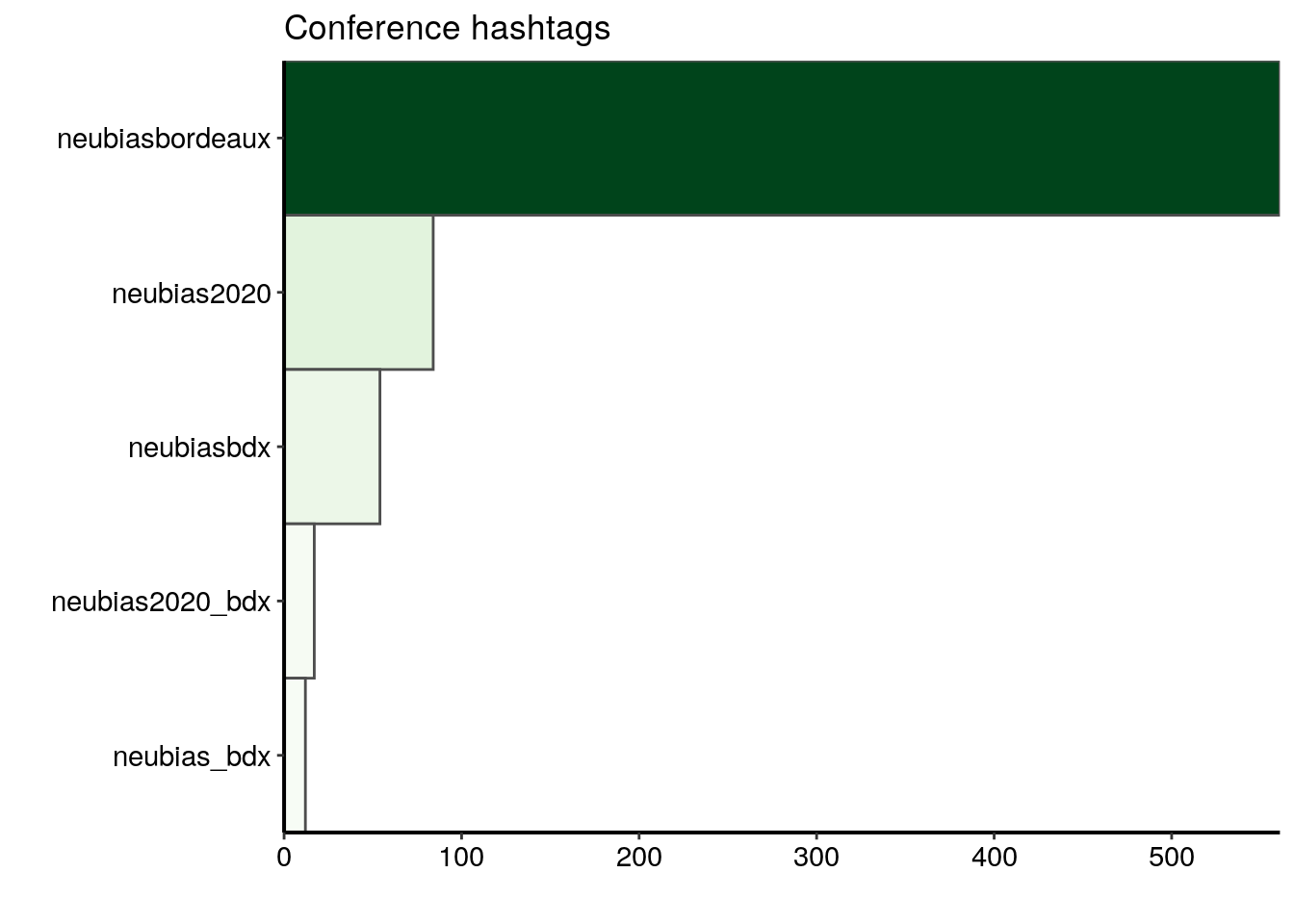
Extracting hashtags associated to the conference hashtags
Again, I choose to work only on the tweets and not on the retweets to highlight the choices of the Twitter users, not what was amplified in the end. As above, I unnest the hashtags column, meaning that I flatten the lists into separate rows. But this time, I keep all the hashtags but the ones of the conference using the homemade function '%!in%', which is the opposite of %in%. I then count the hashtags and arrange them by descending order.
'%!in%' <- function(x,y)!('%in%'(x,y))

hashtags_count <- all_neubiasBdx_unique %>%
  filter(!is_retweet) %>%
  unnest(hashtags) %>%
  mutate(hashtags_unnest = tolower(hashtags)) %>%
  filter(!is.na(hashtags_unnest)) %>%
  filter(hashtags_unnest %!in% c("neubiasbordeaux", "neubias_bdx", "neubiasbdx",
                                 "neubias2020_bdx", "neubias2020")) %>%
  count(hashtags_unnest) %>%
  arrange(desc(n)) %>%
  top_n(10, n)
In the plot below, I display the ten hashtags that are the most frequently associated with the conference hashtags. I see three categories of hashtags:
1) words referring to the conference: neubias, which is the name of the network organising the conference, and ts15, the name of one of the training schools
2) words referring to the bioimage analysis domain: bioimageanalysis, deeplearning, opensource, openscience and microscopy
3) words referring to a bioimage analysis tool in particular: deepimagej, clij and clij2 (three ImageJ/Fiji plugins)
ggplot(data = hashtags_count) +
   geom_col(aes(fct_reorder(hashtags_unnest, n), n, fill = n),
           colour = "grey30", width = 1) +
  labs(x = "", y = "", title = "Top 10 associated hashtags") +
  coord_flip() +
  scale_fill_gradientn("n", colours = greenpal(10)) +
  scale_y_continuous(expand = c(0, 0)) +
  scale_x_discrete(expand = c(0, 0)) +
  theme(legend.position = "none")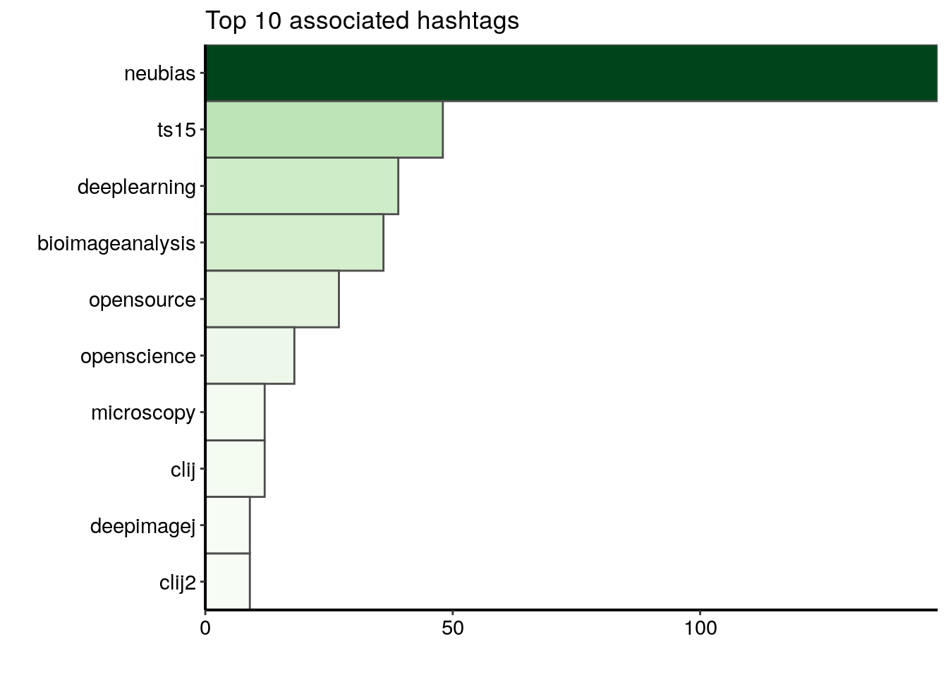
Exploring tweets emojis and text content
I would like to count the number of emojis and highlight the words used the most often in tweets with a wordcloud. In the data collected and aggregated in part 1 “Analysing twitter data with R: Collecting Twitter statuses related to a scientific conference”, the column text contains the text of each tweet. I cannot use the content of the text column directly because tweets are full of punctuation signs, digits, URLs etc.
all_neubiasBdx_unique %>%
  filter(!is_retweet) %>%
  select(text) %>%
  mutate(text = gsub(pattern = "\\n\\n", replacement = "\\n", x = text)) %>%
  head()  %>%
knitr::kable(escape = TRUE)| text |
|---|
| @BoSoxBioBeth points out to train the trainers. Like a @thecarpentries curriculum for bioimageanalysts #bioimageanalysis #neubiasBordeaux @NEUBIAS_COST |
| Now @haesleinhuepf from @csbdresden @mpicbg with #clij and #clij2 and beautiful time-lapse movies of Tribolium development! #neubiasBordeaux #opensource #GPUpower shout-out to @Jain_Akanksha_ who provided the initial Tribolium cultures! https://t.co/bGKPSCFL2z |
| Approaches @institutpasteur: open-desk sessions save time since questions are answered in large audience. Once a week so not long waiting time. Entry points for projects and collaboration. 25% increasen 2019 @StRigaud #neubiasBordeaux |
| @SimonFlyvbjerg Factoid: “no publications in the first 4 years” @SimonFlyvbjerg ufff that sounds discouraging! #neubiasBordeaux @NEUBIAS_COST nReasons: physical absence, time-lag serice publishing, approach: needs to be brought up at the beginning, written agreement, followup! |
| @florianjug @BoSoxBioBeth @Co_Biologists @neuromusic @ChiguireKun @ilastik_team @NEUBIAS_COST @FijiSc I would not say strange. I think @FijiSc is visible at #neubiasBordeaux. It is also good to have a wide range of representatives at this panel. Maybe @FijiSc needs a bit of a sharper profile also in terms of representation overall. I try to hold the Fiji flag high for my part :) |
| @IgnacioArganda introducing us to machine learning and later deep learning with @FijiSc #neubiasBordeaux #openscience #bioimageanalysis super cool, check it out: https://t.co/Wf1iYzQZqA https://t.co/74yjN4kOeL |
I need to filter the dataset to keep only the tweets, not the retweets, then to clean the content of the tweets’ text, i.e. to remove the account names, urls, punctuation signs and digits, and to lowercase the text.
text_only <- all_neubiasBdx_unique %>%
filter(!is_retweet) %>%
mutate(
# add spaces before the # and @
clean_text = gsub(x = text, pattern = "(?=@)",
replacement = " ", perl = TRUE) %>%
gsub(x = ., pattern = "(?=#)", replacement = " ", perl = TRUE) %>%
str_replace_all(pattern = "\n", replacement = "") %>%
str_replace_all(pattern = "&", replacement = "") %>%
# remove accounts mentionned with an @
str_replace_all(pattern = "@([[:punct:]]*\\w*)*", replacement = "") %>%
# remove URLs
str_replace_all(pattern = "http([[:punct:]]*\\w*)*", replacement = "") %>%
# remove punctuaction signs except #
gsub(x = ., pattern = "(?!#)[[:punct:]]",
replacement = "", perl = TRUE) %>%
# lowercase the text
tolower() %>%
# remove isolated digits
str_replace_all(pattern = " [[:digit:]]* ", replacement = " ")
)Extracting emojis from tweets
I now look at the emojis in the tweets. I use the dataset emojis from {rtweet} to identify the emojis in the tweets’ text.
all_emojis_in_tweets <- emojis %>%
  # for each emoji, find tweets containing this emoji
  mutate(tweet = map(code, ~grep(.x, text_only$text))) %>%
  unnest(tweet) %>%
  # count the number of tweets in which each emoji was found
  count(code, description) %>%
  mutate(emoji = paste(code, description))
Only 71 different emojis were used in tweets from this dataset and most of them are not used more than two times. In the top 20 most used emojis, I find many smilling and happy faces, as well as some symbols related to the bioimage analysis domain, such as a laptop computer or a microscope.
all_emojis_in_tweets %>%
  top_n(20, n) %>%
ggplot() +
  geom_col(aes(x = fct_reorder(emoji, n), y = n, fill = n),
           colour = "grey30", width = 1) +
  labs(x = "", y = "Count", title = "Most used emojis") +
  coord_flip() +
  scale_fill_gradientn("n", colours = greenpal(10), guide = "none") +
  scale_y_continuous(expand = c(0, 0),
                     breaks=seq(0, 10, 2), limits = c(0,10)) +
scale_x_discrete(expand = c(0, 0)) 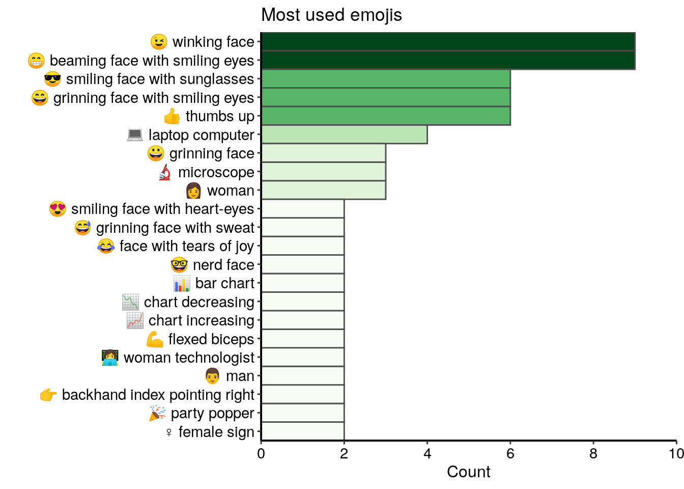
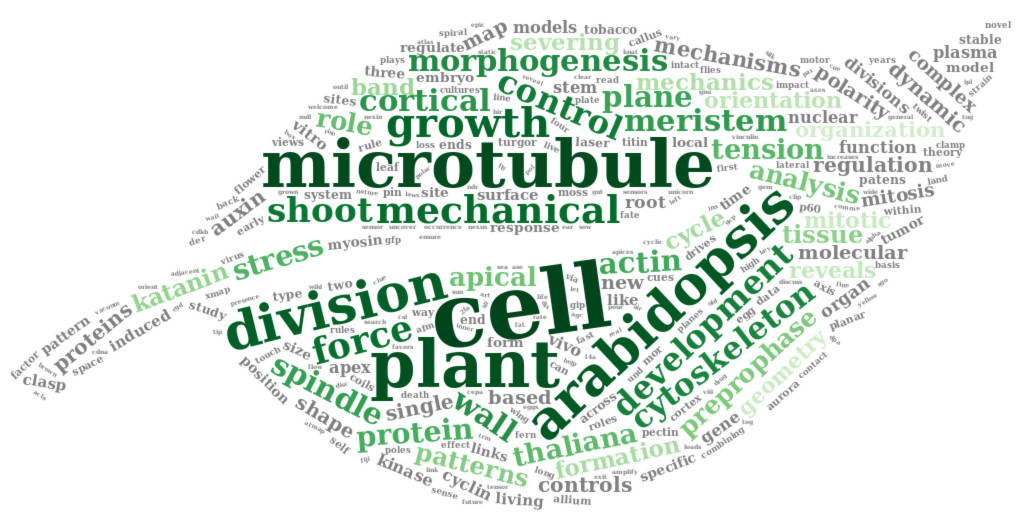
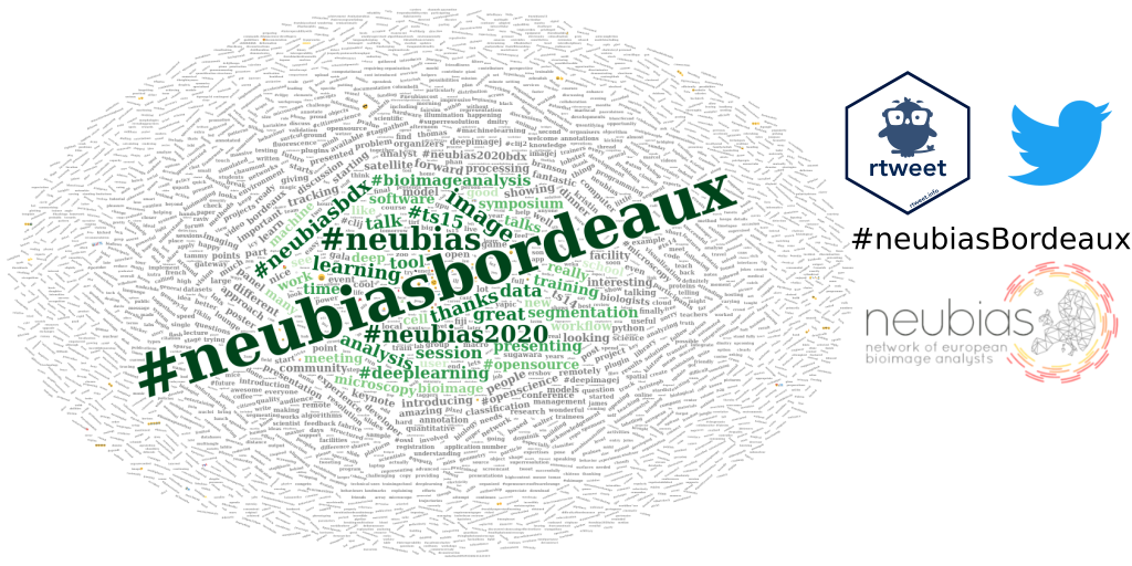
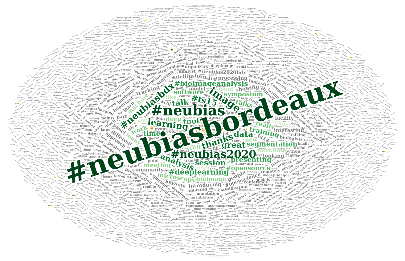
Exploring text content of tweets with a wordcloud
I now would like to highlight the most common words in the tweets with a wordcloud. As I didn’t remove the #, I will be able to visually separate the hashtags from the other words. To create a wordcloud, I use a similar procedure as the one I described in the article Analysing bibliographical references with R. I first convert the cleaned text to a corpus and then remove stopwords, whitespace, plurals and common words.
docs <- SimpleCorpus(VectorSource(text_only$clean_text),
                     control = list(language = "en"))

docs_cleaned <- tm_map(docs, removeWords, stopwords("english"))
docs_cleaned <- tm_map(docs_cleaned, stripWhitespace)

tosingular <- content_transformer(
  function(x, pattern, replacement) gsub(pattern, replacement, x)
  )

docs_cleaned <- tm_map(docs_cleaned, tosingular, "cells", "cell")
  docs_cleaned <- tm_map(docs_cleaned, tosingular, "workflows", "workflow")
  docs_cleaned <- tm_map(docs_cleaned, tosingular, "tools", "tool")
  docs_cleaned <- tm_map(docs_cleaned, tosingular, "images", "image")
  docs_cleaned <- tm_map(docs_cleaned, tosingular, "users", "user")
  docs_cleaned <- tm_map(docs_cleaned, tosingular, "analysts", "analyst")
  docs_cleaned <- tm_map(docs_cleaned, tosingular, "developers", "developer")
  docs_cleaned <- tm_map(docs_cleaned, tosingular, "schools", "school")

rm_words <- c("will", "use", "used", "using", "today", "can", "one", "join", "day", "week", "just", "come", "first", "last", "get", "next", "via", "dont", "also", "want", "make", "take", "may",  "still", "need", "now", "another", "maybe", "getting", "since", "way")
docs_cleaned <- tm_map(docs_cleaned, removeWords, rm_words)
To visualise the corpus, I use the function inspect() from {tm}.
inspect(docs_cleaned)Then I create the term document matrix, which contains the frequency of each word. As a reminder, the term-document matrix is a contigency table with all the words and their counts.
dtm <- TermDocumentMatrix(docs_cleaned)
m <- as.matrix(dtm)
v <- sort(rowSums(m), decreasing = TRUE)
d <- data.frame(word = names(v), freq = v)
I first visualise the top 15 words excluding the conference hashtags. I see some hashtags other than the conference hashtags, words related to the conference lexicon and the positive words “thanks” and “great”.
d %>%
  filter(word %!in% c("#neubiasbordeaux", "#neubias_bdx", "#neubiasbdx",
                      "#neubias2020_bdx", "#neubias2020")) %>%
  top_n(15, freq) %>%
ggplot() +
  geom_col(aes(fct_reorder(word, freq), freq, fill = freq),
           colour = "grey30", width = 1) +
  labs(x = "", y = "Count of occurences",
       title = "Top 10 words, excluding conference hashtags") +
  coord_flip() +
  scale_fill_gradientn("freq", colours = greenpal(10), guide = FALSE) +
  scale_y_continuous(expand = c(0, 0)) +
  scale_x_discrete(expand = c(0, 0)) +
  custom_plot_theme()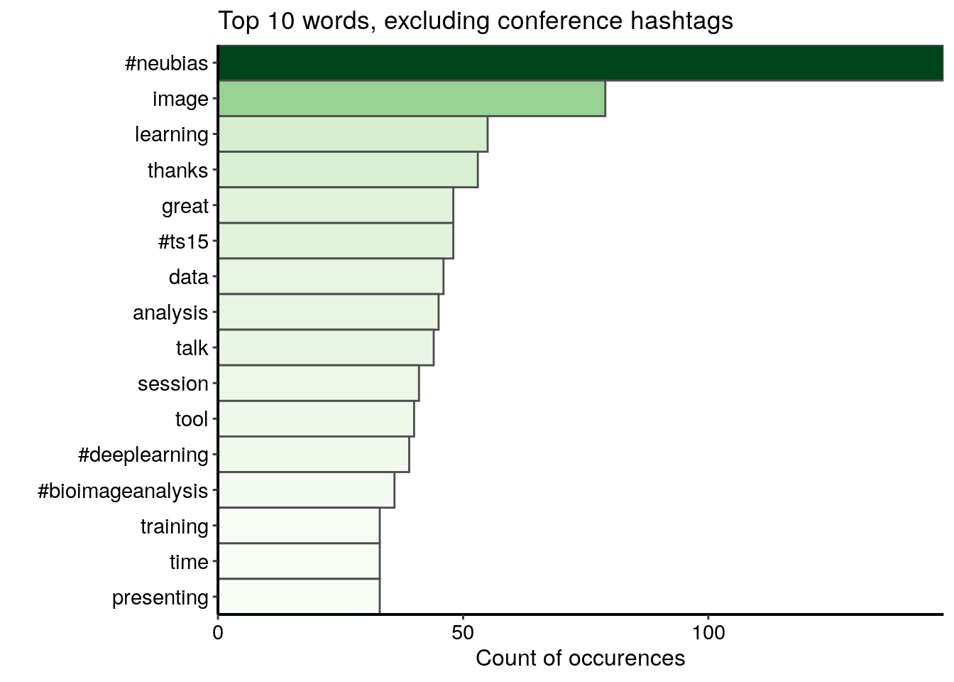
I then construct the wordcloud. This time I keep the conference hashtags.
l <- nrow(d)

# Change to square root to reduce difference between sizes
d_sqrt <- d %>%
  mutate(freq = sqrt(freq))

  my_graph <- wordcloud2(
  d_sqrt,
  size = 0.5, # sqrt : 0.4
  minSize = 0.1, # sqrt : 0.2
  rotateRatio = 0.6,
  gridSize = 5, # sqrt : 5
  color = c(rev(tail(greenpal(50), 40)),
            rep("grey", nrow(d_sqrt) - 40)) # green and grey
)
Conclusion
This blog post is the third and last part of my series “Analysing twitter data with R”. In the first part, I explained how I collected Twitter statuses related to a scientific conference. In the second part, I explored user profiles and relationships between users.
In this third and last part, I explored the content of tweets:
- I identified the most popular conference hashtag among the 5 hashtags suggested by the conference organizers
- I extracted the hashtags associated to the conference hashtags
- I found the most frequently used emojis, and discovered that emojis are not very present in this dataset
- I highlighted the most commonly used words with a wordcloud
Acknowledgements
I would like to thank Dr. Sébastien Rochette for his help on the emojis extraction.
Citation:
For attribution, please cite this work as:
Louveaux M. (2020, Apr. 18). "Analysing Twitter data: Exploring tweets content". Retrieved from https://marionlouveaux.fr/blog/2020-04-18_analysing-twitter-data-with-r-part3/.
@misc{Louve2020Analy,
    author = {Louveaux M},
    title = {Analysing Twitter data: Exploring tweets content},
    url = {https://marionlouveaux.fr/blog/2020-04-18_analysing-twitter-data-with-r-part3/},
    year = {2020}
  }

Share this post
Twitter
Google+
Facebook
LinkedIn
Email